The Apple apps I love and the ones I don’t
Sam Kaplan
January 9, 2023
Recently, a design-oriented friend told me to give Apple Music and Maps another try. This led me down a rabbit hole of thinking about how Apple designs apps and iOS design in general. In my opinion, Apple has made some of the best designed iOS apps - truly beautiful and great to use. But, I don’t think Apple always gets it right, and the same design system that makes such wonderful apps can be a straight jacket for others.
Let’s start with the apps I love.
Photos
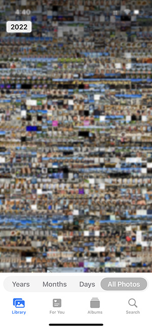
Photos is an amazing app, which makes sense considering the iPhone is basically a professional camera at this point. The main library view is genius. Instead of a bored grid of photos, we get an interactive one that feels alive. You can seamlessly pinch in and out seamlessly shifting between different behaviors at different levels of hierarchy. It’s fun and it’s very efficient.
Photos is absolutely packed with functionality. Its image editing includes tens of subtools. It has sharing, facial recognition, ai-assisted search, memories, and many more. My only gripe with Photos is that it can be buggy to invite people to shared albums. But, overall a 10/10 app.
Messages
I probably have more messaging apps on my phone than any other type of app. So, I don’t say it lightly when I say that Messages is the best messaging app I’ve used.
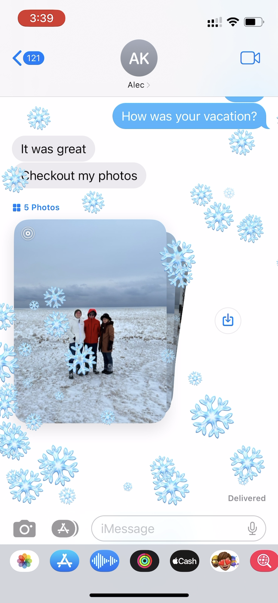
The main messaging timeline is pixel perfect with beautiful blue bubbles. Polish layers on top of polish with subtle motion effects while scrolling, 3d stacks of groups of photos, and fun Bubble/Screen Effects. Messages has good implementations of reactions, threads, and voice notes. And, it’s deeply integrated with the whole OS including with FaceTime, Find My, Notes, Photos, and iCloud for larger transfers.
Support for third party developers is both a strength and a weakness. Messages Apps and Extensions expose dramatically more surface area to developers than most other messaging apps. However, they are still quite limited. Developers can let users create stickers and other multimedia content. In addition, users can send messages which open up to mini-apps when the recipients click on it. But, there’s no support for developers to interact with the conversation itself. I think Slack is a great example of what happens when there’s deeper developer support. Chat turns from a way to message people to a universal interface.
Overall, Messages isn’t just an app it’s a moat - the Blue Bubble monopoly. And, there’s a reason people love iMessage. It’s fast, clean, and deep with functionality. It makes messaging feel effortless.
Safari
I would be totally remiss if I didn’t include Safari. This was the app which started it all. I remember watching the original iPhone keynote. The whole thing was impressive, but damn Safari was hot. Safari brought the full web to everyone’s pocket.
Safari’s core web view showcases the best parts of iOS UI: momentum scrolling, pinching, tapping, and selecting text.
But, Safari isn’t just one giant web view. It fits cleanly with Apple’s overall design system while being packed with UI tricks that make browsing the web a breeze. Don’t believe me? Download Chrome for iOS and check back.
Switching tabs is as smooth as butter, left and right or pinching out. The heterodox placement of the address bar at the bottom is human centric based on normal thumb position. A healthy extension ecosystem provides well integrated ad blockers and password managers. Reader mode de-crapifys most websites. Favorites, bookmarks, and search work quite well.
There are inherent issues to browsing the web on a small screen. Safari makes the experience pleasant and easy.
App’s I don’t like
The main Apple apps I’ve ditched are Maps, Apple Music, Calendar and Mail. When I last tried Maps, the data was so bad that I had to switch back to Google. I also tried Apple Music for a few months when it first came out, but it never stuck. I use Google Workspace so Gmail and Google Calendar simply have better integrations.
But, over the past two weeks, I’ve tried Apple Maps and Music again. I’m still not sold.
Apple Music
Steve Jobs loved music, so Apple Music should be the best app on iOS. Rewatch the original iPhone keynote and see how many times Steve talks about the beautiful album art. A large reason that the iPod was so successful was that iTunes just worked. Of course, iTunes bloat and decay over the years is well known.
Apple Music closely follows the Apple design system which automatically gives the app a level of elegance. But, this elegance is skin deep. Photos, Messages, and Safari all used Apple’s design principles as a starting point, but innovated and are based around rich custom UI elements. Take the most innovative screen:
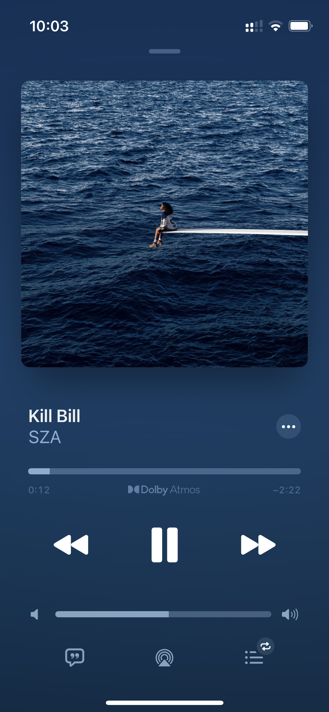
This screen is pretty - big album art, dynamic background color, and clean controls. The lyrics display blows Spotify’s out of the water. But, in terms of usability, this screen is a bit lacking. This gets to one of my biggest complaints: overgrown context menus.
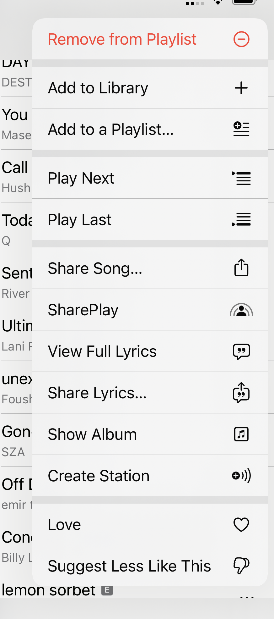
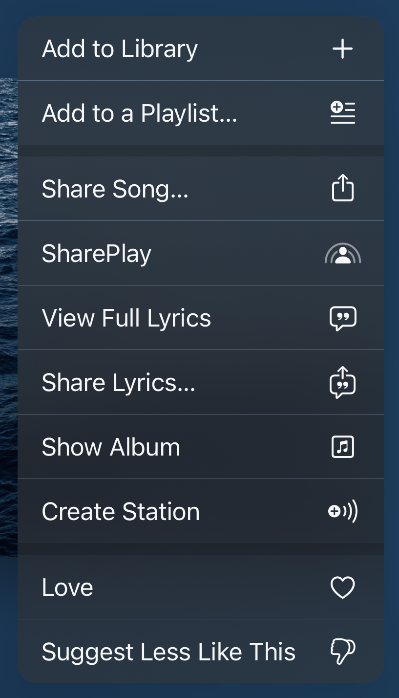
I got a headache the first time I opened these. Context menus are fine, even large context menus. For instance, Safari has a large context menu launched from the URL bar, but you very rarely open it. The prominence of the button has to be proportional to usage. It’s not good that you can’t easily Love a song when you’re listening to it. It’s easy to add just one more item to a context menu. It’s hard to make a UI where you don’t need one.
And, that’s how Music feels. Pretty, but without Love. On the other hand, Spotify is certainly uglier, but also feels warmer.
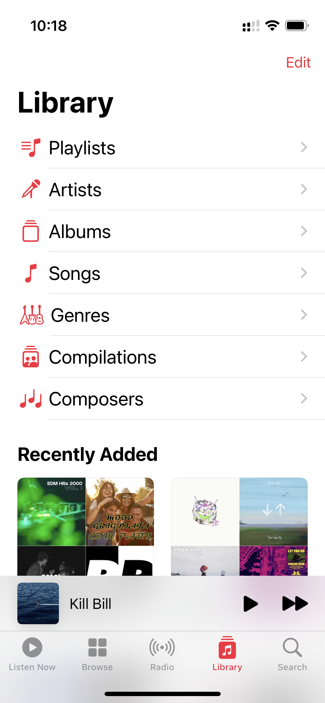
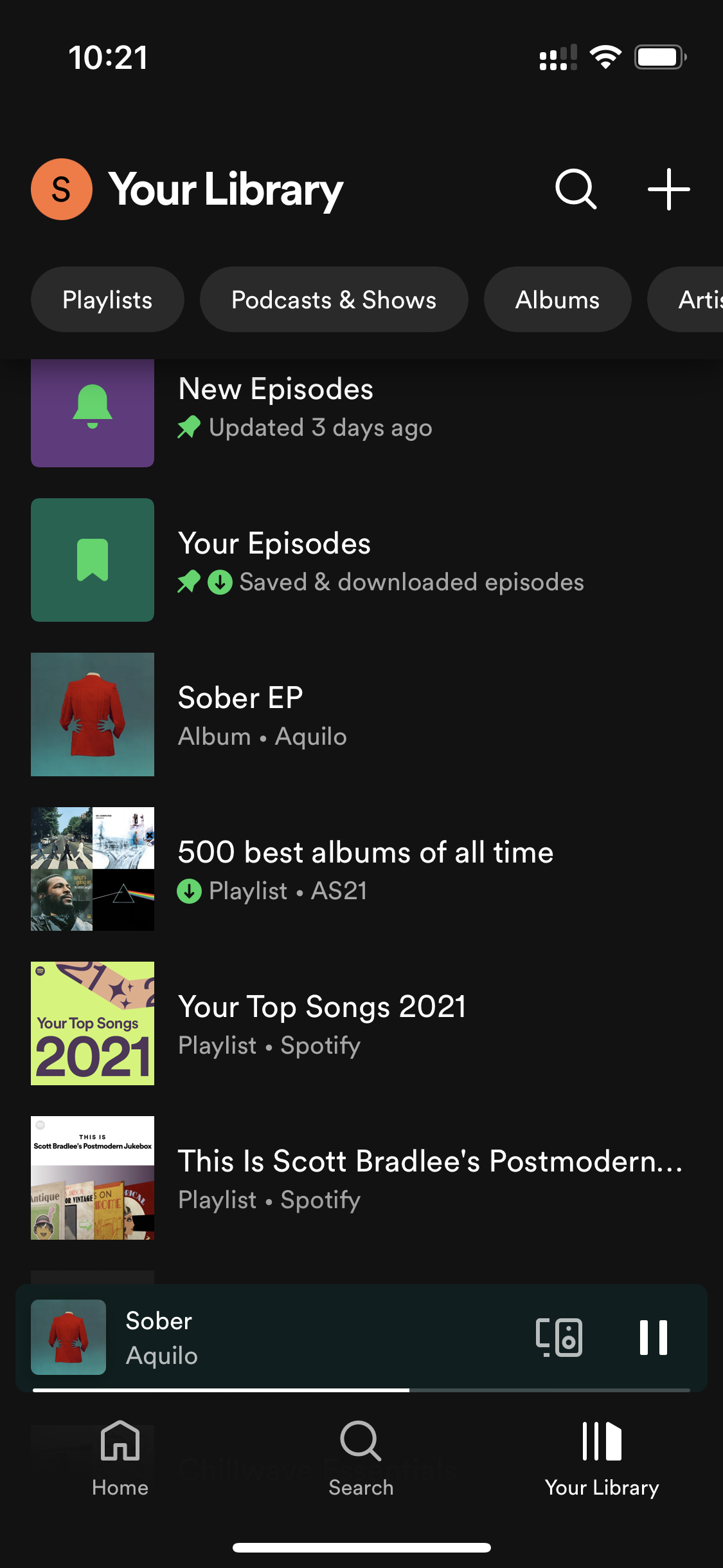
In Apple Music, on the Library tab, you see whatever you recently added and can hierarchically navigate to songs. On Spotify, you see a flat list of playlists, albums, and artists that you’ve recently listened to. While Apple’s solution is more logical and comprehensive, Spotify’s is more practical and usable.
There are some differences in functionality: Apple’s curated playlists are better, Spotify has billions of crowd sourced playlists, Spotify has better speaker and cross device controls, Apple’s Sing karaoke feature is very cool. But, both are more similar in functionality than they are different. And both frustratingly don’t let you see a list of all of an artist’s songs.
So, is Spotify better than Apple Music? I’m not sure. But, there’s probably a reason that I switched back to Spotify from Apple Music the first time. What I can say for certain is that Apple Music doesn’t live up to Steve Jobs memory. It feels under-resourced and constrained rather than empowered by Apple’s design system. I think Apple’s Spotify Wrapped clone Replay says it all. Instead of keeping it tightly integrated with the app, they ejected and sent users to Safari.
Maps
Maps is a bit different from Music. While I do have some gripes about the design, the main difference is functionality and data.
Apple Maps started entirely as an F U to Google. A reminder that the world’s most valuable company doesn’t play around. Generally though, an F U is not the best way to get started especially in an area outside of your core competence.
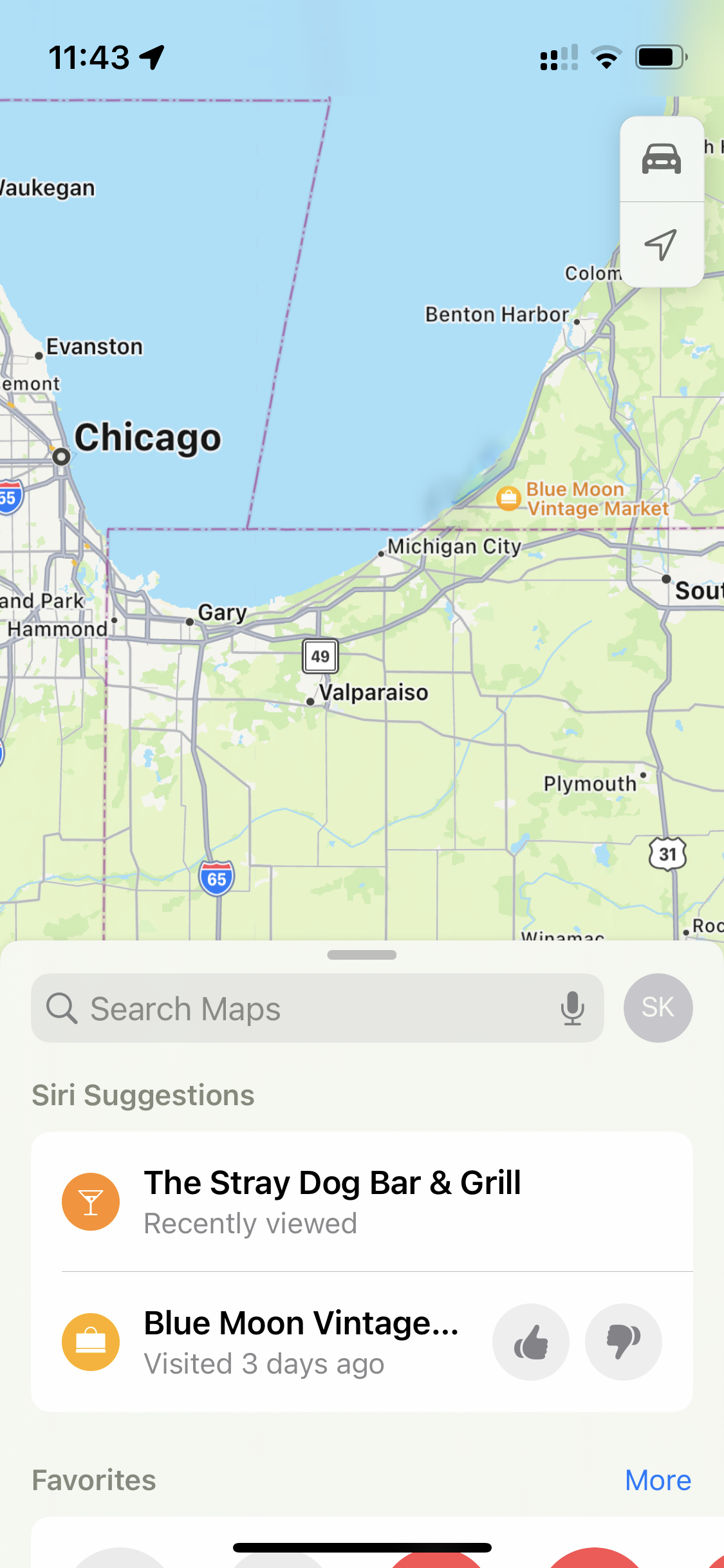
Starting from the top, there’s a big difference between Google and Apple’s satellite data. This is the same exact location:
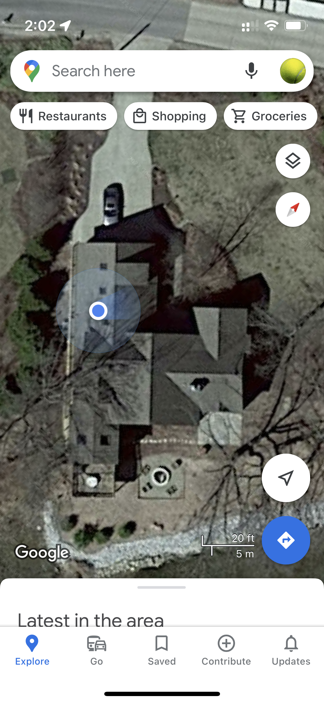
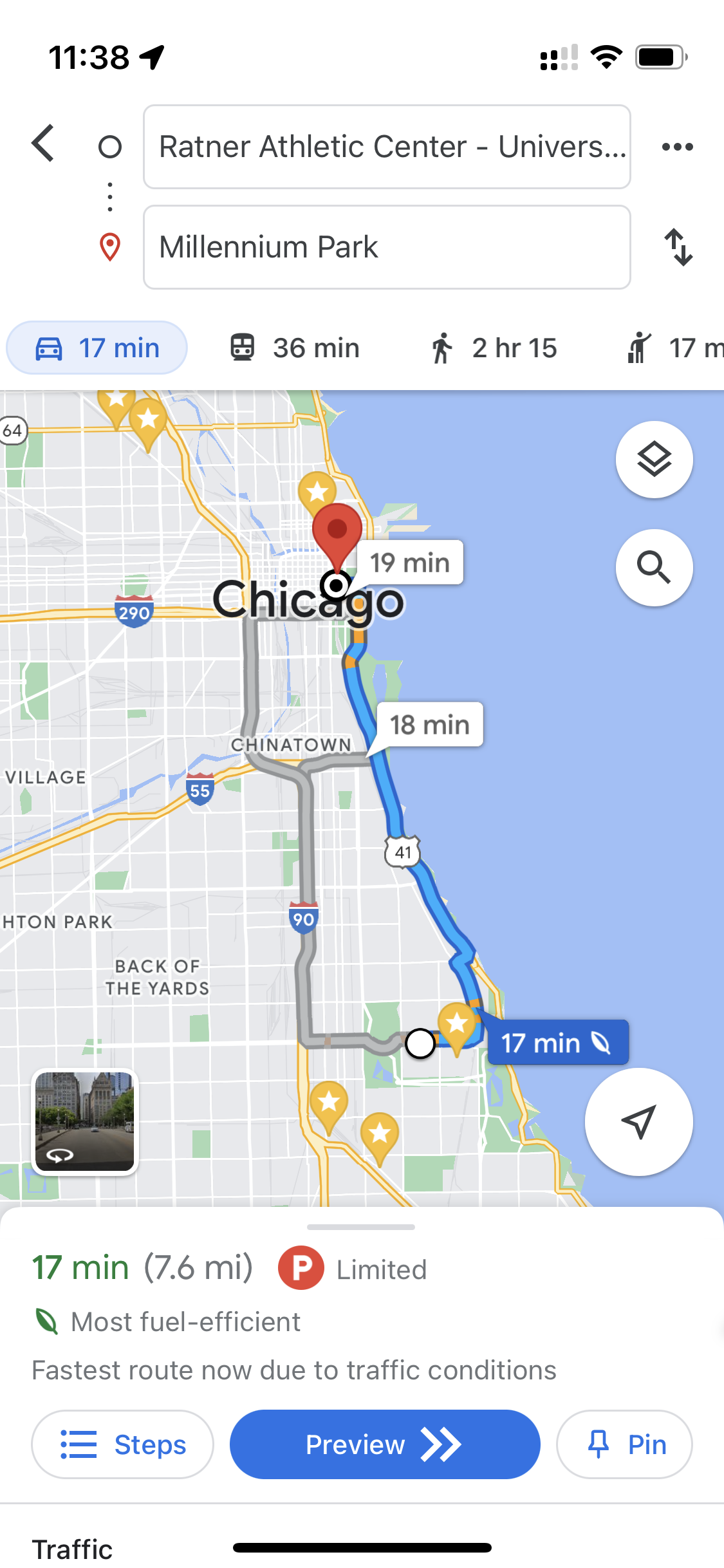
I recently tested both while driving between Chicago and Michigan. Apple Maps predicted 1 hour and 13 minutes, Google predicted 1 hour and 31 minutes. It ended up being 1 hour and 29 minutes. That might seem small, but it’s a big enough difference to suggest a different route. Obviously just one data point is anecdotal. But, Google was almost exactly correct. There have likely been significant improvements since the last time I used Apple Maps, but I still feel Google is much better, especially on less traveled roads. And, a big bonus is that all of this data can be accessed offline with Offline Maps.
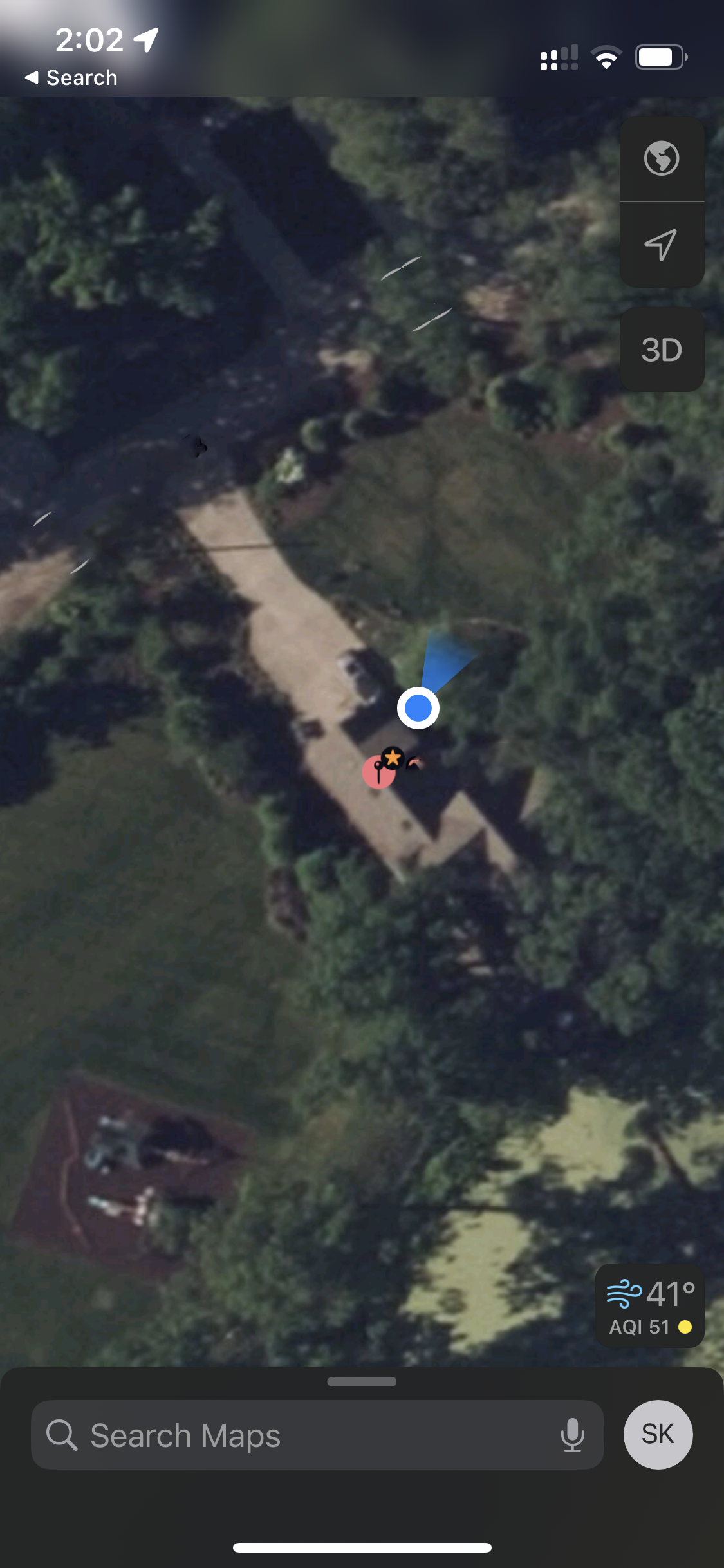
But, by far the biggest L for Apple Maps is its places data. Apple isn’t even trying. The app just links to Yelp. Which makes Apple Maps utterly useless when searching for anything that has reviews. Unless you enjoy constantly jumping between apps, you have to just use Yelp, whose app sucks and has worse data than Google’s anyway. In addition, the Google Maps search is much better. For instance, searching “Dave’s” will find restaurants named “David’s”.
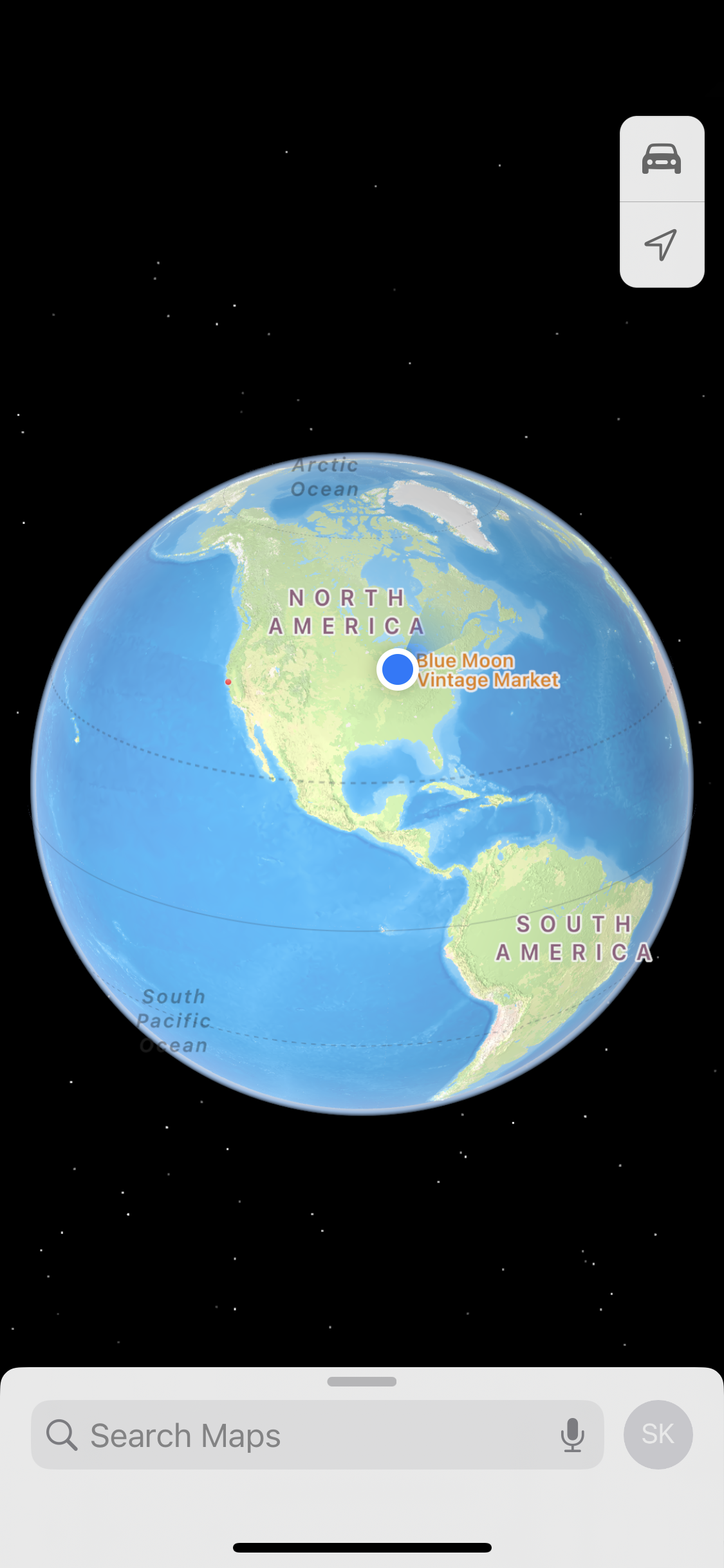
Apple Maps does have some strengths. The globe and other 3D rendering is creative custom UI and very cool. Maps has a big advantage during navigation because it takes over the lock screen, whereas Google Maps can only put notifications on the lock screen. Similarly, Map’s OS level integration is generally better like in iMessage or Siri. And, of course, Apple Maps is much more visually appealing than Google Maps. Apple Maps follows Apple’s great design system, while Google Maps follow’s Google’s plain one.
But, this doesn’t mean that the user experience is better. Just like Spotify, Google Maps feels warmer and easier to use in many places.
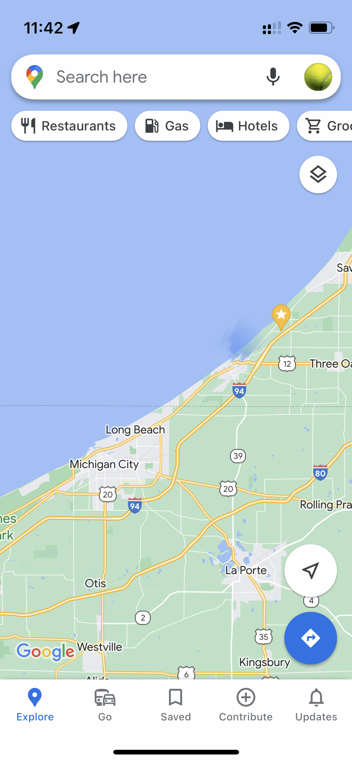
Google Maps opens with a nice big map view and then quick search buttons (”Restaurants”, “Gas”, etc) at the top. I can’t count how many times I’ve pressed the Restaurant or Coffee button right away.
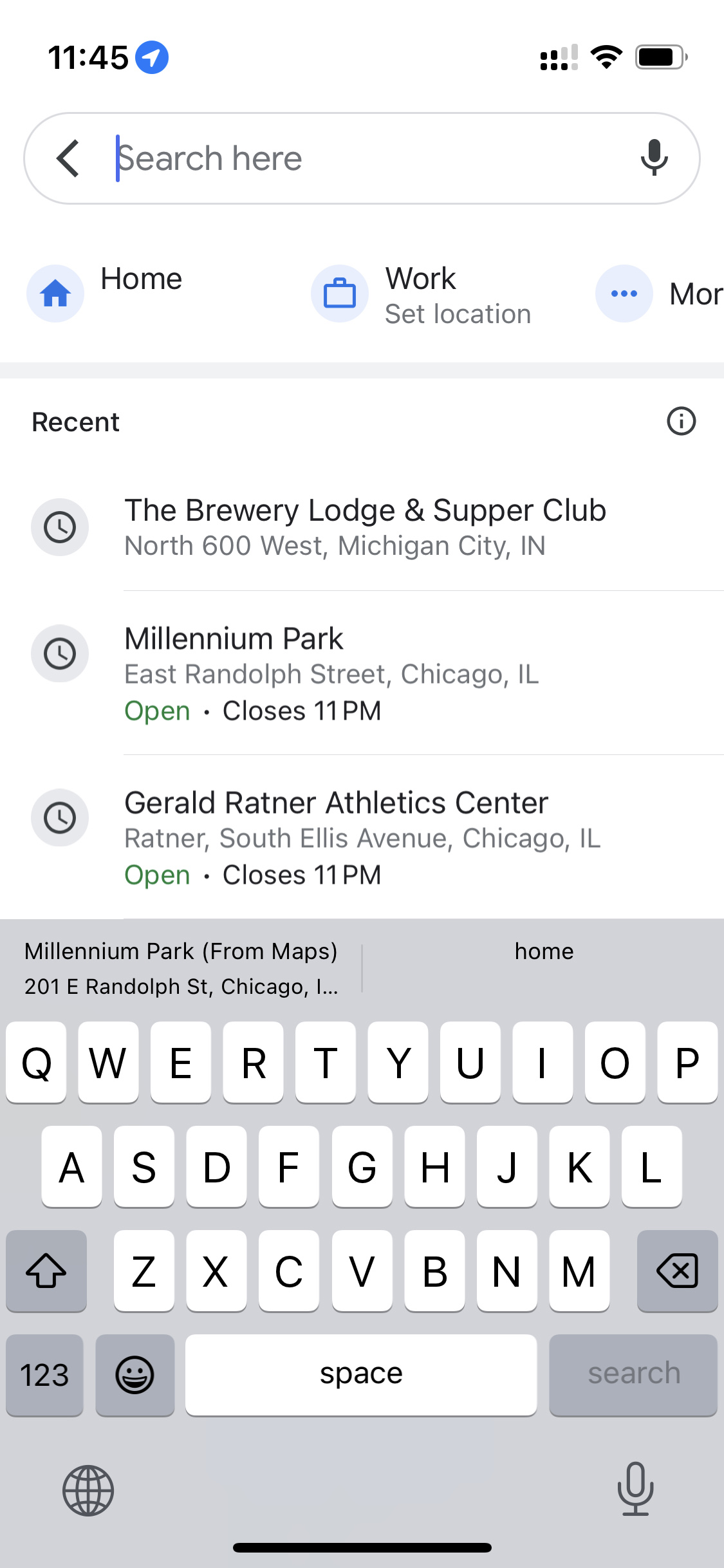
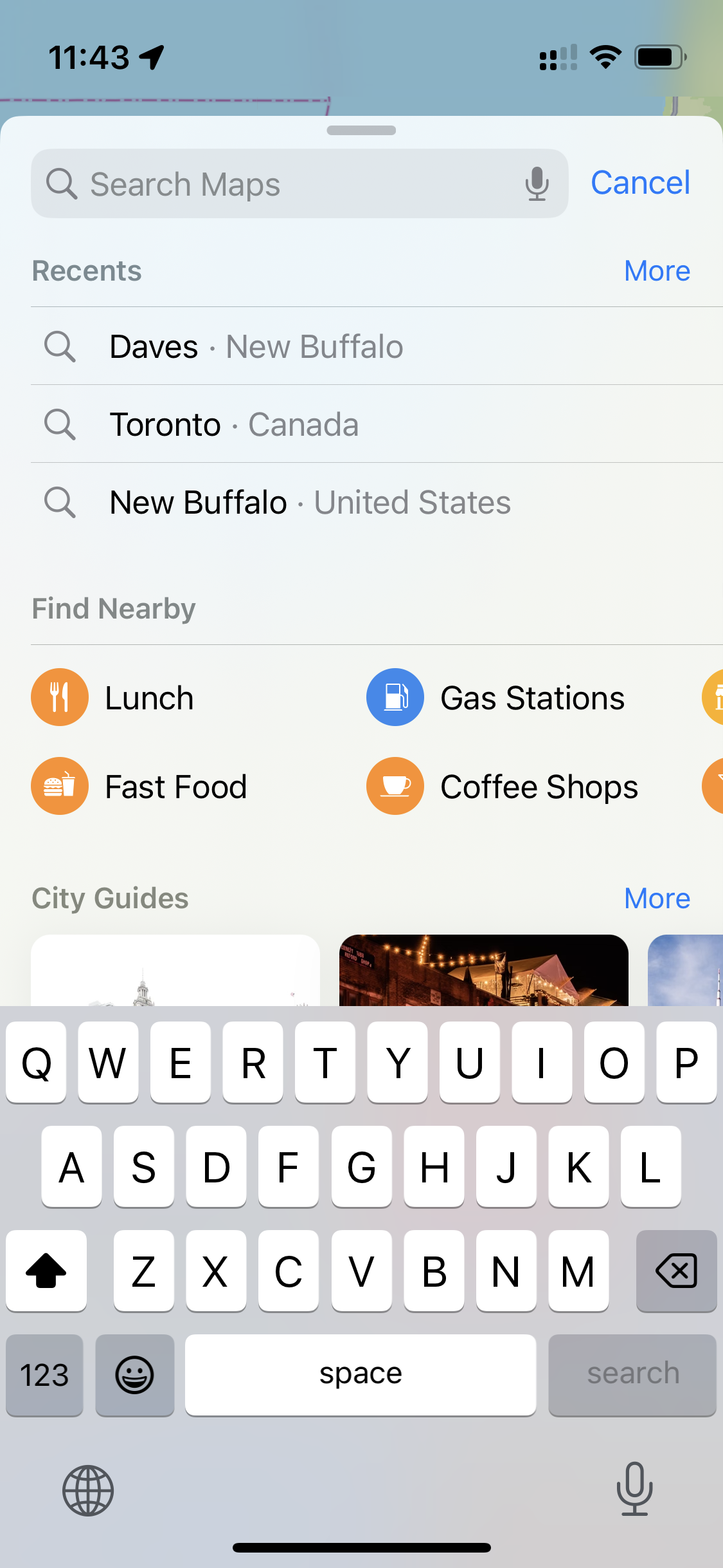
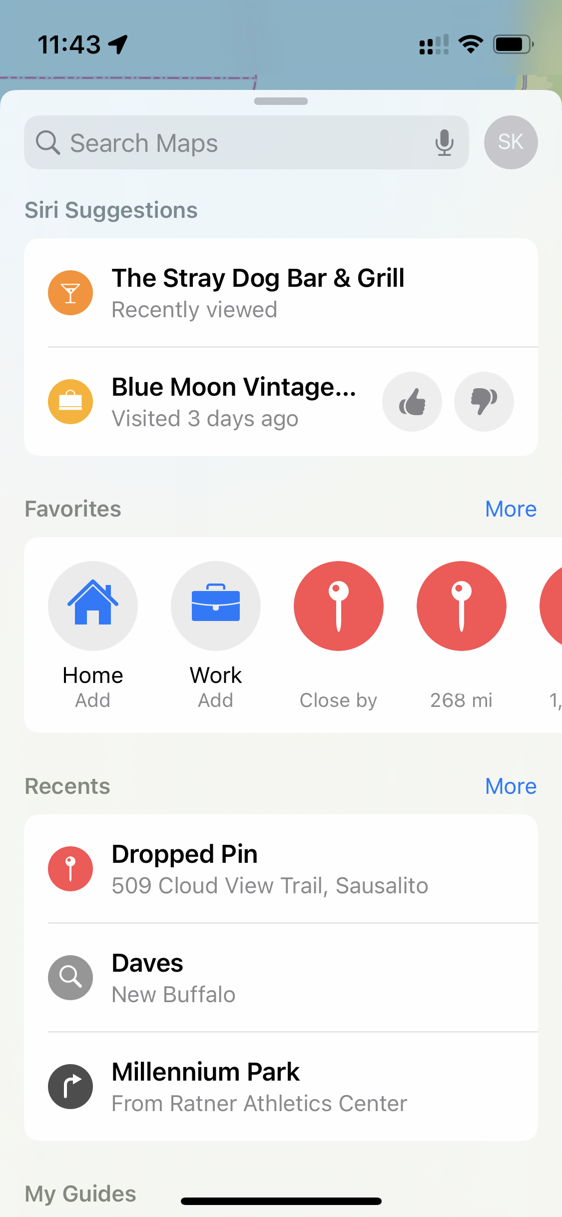
In Google Maps, tapping the search bar reveals your speed dial and then a scrollable list of your recents. In contrast, Apple Maps duplicates recents in both the search screen and the home screen. Each time only showing the three most recent. Everything is bigger in Apple Maps which is easier to read, but also less information dense.

Google Maps shows the estimated time for car, public transit, walking, biking, and rideshare all at once, whereas for Apple Maps you have to check one at a time.
These are small things, but they add up. Google charges developers by far the most for its map data. $0.005 per map load! It’s clear why Google is the 1000 pound gorilla. Their data is better and functionality is much deeper. Apple Maps is pretty and works well enough, but it doesn’t play to Apple’s strengths.
Conclusion
Every app is the product of three dimensions: visual design, user experience, and depth of functionality. The great apps nail all three. With deep design DNA and, of course, being the creator of the iPhone, Apple is probably the best maker of apps period. So, we can learn a lot from their successes and failures. Apple Music shows us that it’s not enough to follow a great design system. Building a great app requires creativity from top to bottom. And, Apple Maps shows us that beauty alone can’t beat functionality. That’s not to say that Apple Maps or Music aren’t really, really good apps. They are. But, Apple has shown us they can do great things, and now I expect no less.